BootStrap
2024/12/19大约 11 分钟
BootStrap
validate做表单校验
Bootstrap :页面布局和美化
一、validate插件
1.1、validate插件概述
为了更好地实现人机交互,使用jQuery封装库中的validate插件,在用户填写表单时,可以快速地对用户填写的数据进行验证,并做出反馈。
Validation拥有如下特点:
- 内置验证规则: 拥有必填、数字、Email、URL和信用卡号码等19类内置验证规则;
- 自定义验证规则: 可以很方便地自定义验证规则;
- 简单强大的验证信息提示: 默认了验证信息提示,并提供自定义覆盖默认的提示信息的功能;
- 实时验证: 可能通过keyup或blur事件触发验证,而不仅仅在表单提交的时候验证。
1.2、validate插件入门
使用步骤:
- 导入jQuery文件;
- 导入validate.js;
- 导入messages_zh.js,用于显示中文提示;
- 使用
$("选择器").validate()进行校验;- 在validate中编写校验规则
<!DOCTYPE html>
<html lang="en">
<head>
    <meta charset="UTF-8">
    <title>登录校验</title>
    <style>
        label[class='error'] {
            color: #ff0000;
        }
    </style>
    <script src="js/jquery-3.4.1.min.js"></script>
    <script src="js/jquery.validate.min.js"></script>
    <script src="js/messages_zh.min.js"></script>
    <script>
        $(function () {
            $('#fm').validate({
                rules: {
                    username: {
                        required: true,
                    },
                    password: {
                        required: true
                    }
                },
                messages: {
                    username: '请输入用户名',
                    password: '请输入密码'
                }
            })
        })
    </script>
</head>
<body>
    <form id="fm" action="https://www.baidu.com">
        <p>
            <label>账号</label>
            <input type="text" name="username"/>
        </p>
        <p>
            <label>密码</label>
            <input type="password" name="password"/>
        </p>
        <p>
            <button type="submit">登录</button>
        </p>
    </form>
</body>
</html>
1使用注意点:核心方法 表单的.validate()2传参是对象{},rules:{} ,rules中的规则定义属性是对象,名字要和标签的name属性一致,messages:{},属性是字符串
1.3、validate插件校验规则
| 属性 | 描述 |
|---|---|
| required:true | 必输字段 |
remote:"test.action" | 使用ajax方法调用check.action验证输入值 |
email:true | 必须输入正确格式的电子邮件 |
url:true | 必须输入正确格式的网址 |
| date:true | 必须输入正确格式的日期 日期校验ie6出错,慎用 |
dateISO:true | 必须输入正确格式的日期(ISO),例如:2009-06-23,1998/01/22 只验证格式,不验证有效性 |
number:true | 必须输入合法的数字(负数,小数) |
digits:true | 必须输入整数 |
equalTo:"#field" | 输入值必须和#field相同 |
| maxlength:5 | 输入长度最多是5的字符串(汉字算一个字符) |
minlength:10 | 输入长度最小是10的字符串(汉字算一个字符) |
rangelength:[5,10] | 输入长度必须介于 5 和 10 之间的字符串(汉字算一个字符) |
range:[5,10] | 输入值必须介于 5 和 10 之间 |
max:5 | 输入值不能大于5 |
min:10 | 输入值不能小于10 |
<!DOCTYPE html>
<html lang="en">
<head>
    <meta charset="UTF-8">
    <title>登录校验</title>
    <style>
        label[class='error'] {
            color: #ff0000;
        }
    </style>
    <script src="js/jquery-3.4.1.min.js"></script>
    <script src="js/jquery.validate.min.js"></script>
    <script src="js/messages_zh.min.js"></script>
    <script>
        $(function () {
            $('#fm').validate({
                rules: {
                    username: {
                        required: true,
                        rangelength:[6,10]
                    },
                    password: {
                        required: true,
                        rangelength:[6,10]
                    },
                    password1: {
                        required: true,
                        equalTo: "input[name='password']"
                    }
                },
                messages: {
                    username: '用户名长度必须是6~10位的字符',
                    password: '密码长度必须是6~10位的字符',
                    password1: '两次输入的密码必须相同'
                }
            })
        })
    </script>
</head>
<body>
    <form id="fm" action="https://www.baidu.com">
        <p>
            <label>账号</label>
            <input type="text" name="username"/>
        </p>
        <p>
            <label>密码</label>
            <input type="password" name="password"/>
        </p>
        <p>
            <label>重复密码</label>
            <input type="password" name="password1"/>
        </p>
        <p>
            <button type="submit">注册</button>
        </p>
    </form>
</body>
</html>
二、Bootstrap
2.1、Bootstrap概述
- Bootstrap是一个用于快速开发Web应用程序和网站的前端框架。Bootstrap是基于HTML、CSS、JavaScript的。Bootstrap是由Twitter的Mark Otto和Jacob Thornton开发的。Bootstrap是2011年八月在GitHub上发布的开源产品。
- Boostrap特点:
- 移动设备优先,自Bootstrap 3起,框架包含了贯穿于整个库的移动设备优先的样式。
- 浏览器支持,所有的主流浏览器都支持Bootstrap。
- 容易上手:只要您具备HTML和CSS的基础知识,您就可以开始学习Bootstrap。
- 响应式设计:Bootstrap的响应式 CSS 能够自适应于台式机、平板电脑和手机。
2.2、入门案例
<!DOCTYPE html>
<html lang="en">
<head>
    <meta charset="UTF-8">
    <title>bootstrap起步</title>
    <link rel="stylesheet" href="css/bootstrap.css" />
    <!-- jQuery必须在bootstrap js文件的前面 -->
    <script src="js/jquery-3.4.1.min.js"></script>
    <script src="js/bootstrap.js"></script>
</head>
<body>
    <!--
        html
        css
        做网页
        一、是什么
            “框架” -- 软件的半成品
            Bootstrap -- 前端的UI框架

            中文官网:https://v3.bootcss.com/
        二、环境搭建
            在网页中引入各种资源就可以使用 --- 需要依赖jQuery
                |---1.bootstrap的css
                |---2.jQuery(2必须在3的前面)
                |---3.bootstrap的js
    -->
    <h1>标题1 hello BootStrap</h1>
</body>
</html>
使用步骤: 1.引人bootstrap的css2.引入jQuery3.bootstrap的js
2.3、栅格系统 常用
1 一个大div包裹 class=container 或 container-fluid
2 一行div class= row
3 行内布局 div class= col-md-1
<!DOCTYPE html>
<html lang="en">
<head>
    <meta charset="UTF-8">
    <title>栅格系统</title>
    <link rel="stylesheet" href="css/bootstrap.css" />
    <!-- jQuery必须在bootstrap js文件的前面 -->
    <script src="js/jquery-3.4.1.min.js"></script>
    <script src="js/bootstrap.js"></script>
    <style>
        div[class^='col-md-'] {
            border: 1px solid black;
        }


    </style>
</head>
<body>
    <!--
        1.布局 --- 在什么位置放特定的内容 --- 如何实现布局? div+css 栅格系统
        2.在bootstrap中布局需要container容器 -- 其他的元素都要放在这个容器中
            <div class="container"></div>   有宽度,居中,两侧留白
            <div class="container-fluid"></div>   占据整个页面
    -->
    <div class="container">
        <div class="row text-center">
             <div class="col-md-1">1</div>
             <div class="col-md-1">1</div>
             <div class="col-md-1">1</div>
             <div class="col-md-1">1</div>
             <div class="col-md-1">1</div>
             <div class="col-md-1">1</div>
             <div class="col-md-6 text-center">6</div>
        </div>
    </div>
    <!--<div class="container-fluid" style="background-color: red;">hello container-fluid</div>-->
</body>
</html>
栅格系统案例
<!DOCTYPE html>
<html lang="en">
<head>
    <meta charset="UTF-8">
    <title>栅格系统</title>
    <link rel="stylesheet" href="css/bootstrap.css" />
    <!-- jQuery必须在bootstrap js文件的前面 -->
    <script src="js/jquery-3.4.1.min.js"></script>
    <script src="js/bootstrap.js"></script>
    <style>
        div[class^='col-md-'] {
            border: 1px solid black;
        }
    </style>
</head>
<body>
    <!--
        1.布局 --- 在什么位置放特定的内容 --- 如何实现布局? div+css 栅格系统
        2.在bootstrap中布局需要container容器 -- 其他的元素都要放在这个容器中
            <div class="container"></div>   有宽度,居中,两侧留白
            <div class="container-fluid"></div>   占据整个页面
    -->
    <div class="container-fluid">
        <div class="row">
             <div class="col-md-12" style="height: 100px; background-color: yellow">111</div>
        </div>
        <div class="row">
            <div class="col-md-3" style="height: 500px;">222</div>
            <div class="col-md-9" style="height: 500px;">333</div>
        </div>
        <div class="row">
            <div class="col-md-12" style="height: 100px; background-color: greenyellow;">444</div>
        </div>
    </div>
    <!--<div class="container-fluid" style="background-color: red;">hello container-fluid</div>-->
</body>
</html>
2.4、排版
<!DOCTYPE html>
<html lang="en">
<head>
    <meta charset="UTF-8">
    <title>排版</title>
    <link rel="stylesheet" href="css/bootstrap.css" />
    <!-- jQuery必须在bootstrap js文件的前面 -->
    <script src="js/jquery-3.4.1.min.js"></script>
    <script src="js/bootstrap.js"></script>
</head>
<body>
    <!-- 对齐 -->
    <p class="text-left">hello html</p>
    <p class="text-center">hello css</p>
    <p class="text-right">hello js</p>
    <!-- 列表 -->
    <ul class="list-inline">
        <li><a href="">百度</a></li>
        <li><a href="">新浪</a></li>
        <li><a href="">搜狐</a></li>
    </ul>
</body>
</html>
2.5、表格 常用
<!DOCTYPE html>
<html lang="en">
<head>
    <meta charset="UTF-8">
    <title>表格</title>
    <link rel="stylesheet" href="css/bootstrap.css" />
    <!-- jQuery必须在bootstrap js文件的前面 -->
    <script src="js/jquery-3.4.1.min.js"></script>
    <script src="js/bootstrap.js"></script>
</head>
<body>
    <table class="table table-striped table-bordered table-hover table-condensed">
        <tr>
            <th>id</th>
            <th>name</th>
            <th>addr</th>
        </tr>
        <tr>
            <td>1</td>
            <td>zs</td>
            <td>qd</td>
        </tr>
        <tr>
            <td>1</td>
            <td>zs</td>
            <td>qd</td>
        </tr>
        <tr class="danger">
            <td>1</td>
            <td>zs</td>
            <td>qd</td>
        </tr>
    </table>
</body>
</html>
2.6、表单 常用
.form-group
.form-control
1 表单 class设置为form-horizontal
2一组控件用一个div包裹(用户名是一组 、密码是一组) div的class 设置为form-group
3 label 中class 可以设置col-md-的宽度,同时加上control-label ,输入框用div包裹 ,div加上col-md-宽度,
**4在input中加上 form-control **
缩进:col-md-offset-2
<!DOCTYPE html>
<html lang="en">
<head>
    <meta charset="UTF-8">
    <title>表格</title>
    <link rel="stylesheet" href="css/bootstrap.css" />
    <!-- jQuery必须在bootstrap js文件的前面 -->
    <script src="js/jquery-3.4.1.min.js"></script>
    <script src="js/bootstrap.js"></script>
</head>
<body>
    <form class="form-horizontal">
        <div class="form-group">
            <label for="inputEmail3" class="col-sm-2 control-label">Email</label>
            <div class="col-sm-10">
                <input type="email" class="form-control" id="inputEmail3" placeholder="Email" disabled />
            </div>
        </div>
        <div class="form-group">
            <label for="inputPassword3" class="col-sm-2 control-label">Password</label>
            <div class="col-sm-10">
                <input type="password" class="form-control" id="inputPassword3" placeholder="Password">
            </div>
        </div>
        <div class="form-group">
            <div class="col-sm-offset-2 col-sm-10">
                <div class="checkbox">
                    <label>
                        <input type="checkbox"> Remember me
                    </label>
                </div>
            </div>
        </div>
        <div class="form-group">
            <div class="col-sm-offset-2 col-sm-10">
                <button type="submit" class="btn btn-default">Sign in</button>
            </div>
        </div>
    </form>
</body>
</html>
2.7、按钮 常用
<!DOCTYPE html>
<html lang="en">
<head>
    <meta charset="UTF-8">
    <title>按钮</title>
    <link rel="stylesheet" href="css/bootstrap.css" />
    <!-- jQuery必须在bootstrap js文件的前面 -->
    <script src="js/jquery-3.4.1.min.js"></script>
    <script src="js/bootstrap.js"></script>
</head>
<body>
    <button type="button" class="btn btn-default">click</button>
    <button type="button" class="btn btn-danger">删除</button>
    <button type="button" class="btn btn-primary btn-xs">添加</button>
    <br/>
    <a href="https://www.baidu.com" class="btn btn-primary btn-lg">修改</a>
</body>
</html>
2.8、图像
<!DOCTYPE html>
<html lang="en">
<head>
    <meta charset="UTF-8">
    <title>图像</title>
    <link rel="stylesheet" href="css/bootstrap.css" />
    <!-- jQuery必须在bootstrap js文件的前面 -->
    <script src="js/jquery-3.4.1.min.js"></script>
    <script src="js/bootstrap.js"></script>
</head>
<body>
    <img src="img/logo.jpg" style="height: 100px; width: 100px;" class="img-circle" />
    <img src="img/logo.jpg" style="height: 100px; width: 100px;" class="img-thumbnail" />
    <img src="img/logo.jpg" style="height: 100px; width: 100px;" class="img-rounded" />
</body>
</html>
2.9、图标
span
<!DOCTYPE html>
<html lang="en">
<head>
    <meta charset="UTF-8">
    <title>图标</title>
    <link rel="stylesheet" href="css/bootstrap.css" />
    <!-- jQuery必须在bootstrap js文件的前面 -->
    <script src="js/jquery-3.4.1.min.js"></script>
    <script src="js/bootstrap.js"></script>
</head>
<body>
    <button type="button" class="btn btn-default"><span class="glyphicon glyphicon-search" aria-hidden="true"></span></button>
    <button type="button" class="btn btn-danger"><span style="margin-right: 5px;">删除</span><span class="glyphicon glyphicon-trash"></span></button>
    <button type="button" class="btn btn-primary btn-xs">添加</button>
</body>
</html>
2.10、模态框 常用
1 <button> 标签中, data-toggle="modal" data-target="#myModal"关联按钮和模态框
2 在取消按钮或关闭X中设置,data-dismiss="modal" 用于关闭模态窗口

3 class="modal-header",用于为模态窗口的头部设置样式。

4 class="modal-body",用于为模态窗口的主体设置样式。

5 class="modal-footer",用于为模态窗口的底部设置样式。<!DOCTYPE html>
<html lang="en">
<head>
<meta charset="UTF-8">
<title>模态框</title>
<link rel="stylesheet" href="css/bootstrap.css" />
<!-- jQuery必须在bootstrap js文件的前面 -->
<script src="js/jquery-3.4.1.min.js"></script>
<script src="js/bootstrap.js"></script>
</head>
<body>
<!-- Button trigger modal -->
<button type="button" class="btn btn-primary btn-lg" data-toggle="modal" data-target="#myModal">
Launch demo modal
</button>
<!-- Modal -->
<div class="modal fade" id="myModal" tabindex="-1" role="dialog" aria-labelledby="myModalLabel">
<div class="modal-dialog modal-lg" role="document">
<div class="modal-content">
<div class="modal-header">
<button type="button" class="close" data-dismiss="modal" aria-label="Close"><span aria-hidden="true">×</span></button>
<h4 class="modal-title" id="myModalLabel">添加</h4>
</div>
<div class="modal-body">
<form class="form-horizontal">
<div class="form-group">
<label for="inputEmail3" class="col-sm-2 control-label">Email</label>
<div class="col-sm-10">
<input type="email" class="form-control" id="inputEmail3" placeholder="Email" disabled />
</div>
</div>
<div class="form-group">
<label for="inputPassword3" class="col-sm-2 control-label">Password</label>
<div class="col-sm-10">
<input type="password" class="form-control" id="inputPassword3" placeholder="Password">
</div>
</div>
<div class="form-group">
<div class="col-sm-offset-2 col-sm-10">
<div class="checkbox">
<label>
<input type="checkbox"> Remember me
</label>
</div>
</div>
</div>
<div class="form-group">
<div class="col-sm-offset-2 col-sm-10">
<button type="submit" class="btn btn-default">Sign in</button>
</div>
</div>
</form>
</div>
<div class="modal-footer">
<button type="button" class="btn btn-default" data-dismiss="modal">取消</button>
<button type="button" class="btn btn-primary">保存</button>
</div>
</div>
</div>
</div>
</body>
</html>2.11、案例
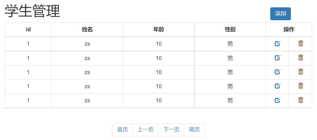
<!DOCTYPE html>
<html lang="en">
<head>
<meta charset="UTF-8">
<title>test</title>
<script src="js/jquery-3.4.1.min.js"></script>
<script src="js/bootstrap.js"></script>
<link rel="stylesheet" href="css/bootstrap.css" />
<style>
.container {
width: 800px;
}
th {
text-align: center;
}
.opt {
width: 60px;
}
</style>
</head>
<body>
<div class="container">
<div class="modal fade" id="myModal" tabindex="-1" role="dialog" aria-labelledby="myModalLabel">
<div class="modal-dialog" role="document">
<div class="modal-content">
<div class="modal-header">
<button type="button" class="close" data-dismiss="modal" aria-label="Close"><span aria-hidden="true">×</span></button>
<h4 class="modal-title" id="myModalLabel">添加学生</h4>
</div>
<div class="modal-body">
<form class="form-horizontal">
<div class="form-group">
<label for="inputEmail3" class="col-sm-2 control-label">姓名</label>
<div class="col-sm-10">
<input type="email" class="form-control" id="inputEmail3" placeholder="Email">
</div>
</div>
<div class="form-group">
<label for="inputPassword3" class="col-sm-2 control-label">年龄</label>
<div class="col-sm-10">
<input type="password" class="form-control" id="inputPassword3" placeholder="Password">
</div>
</div>
<div class="form-group">
<label for="inputPassword3" class="col-sm-2 control-label">性别</label>
<div class="col-sm-10">
<label>
<input type="radio" name="gender" value="male" /> 男
<input type="radio" name="gender" value="female" /> 女
</label>
</div>
</div>
</form>
</div>
<div class="modal-footer">
<button type="button" class="btn btn-default" data-dismiss="modal">Close</button>
<button type="button" class="btn btn-primary">Save changes</button>
</div>
</div>
</div>
</div>
<div class="row">
<h1 class="pull-left">学生管理</h1>
<button class="btn btn-primary pull-right" style="margin-top: 30px;" data-toggle="modal" data-target="#myModal">添加学生</button>
</div>
<div class="row">
<table class="table table-bordered table-hover">
<tr>
<th>id</th>
<th>姓名</th>
<th>年龄</th>
<th>性别</th>
<th colspan="2">操作</th>
</tr>
<tr>
<td>1</td>
<td>zs</td>
<td>20</td>
<td>male</td>
<td class="opt text-center">
<a><span class="glyphicon glyphicon-edit" aria-hidden="true"></span></a>
</td>
<td class="opt text-center" >
<a><span class="glyphicon glyphicon-trash" aria-hidden="true"></span></a>
</td>
</tr>
<tr>
<td>2</td>
<td>ls</td>
<td>20</td>
<td>male</td>
<td class="opt text-center">
<a><span class="glyphicon glyphicon-edit" aria-hidden="true"></span></a>
</td>
<td class="opt text-center" >
<a><span class="glyphicon glyphicon-trash" aria-hidden="true"></span></a>
</td>
</tr>
<tr>
<td>3</td>
<td>ww</td>
<td>20</td>
<td>male</td>
<td class="opt text-center">
<a><span class="glyphicon glyphicon-edit" aria-hidden="true"></span></a>
</td>
<td class="opt text-center" >
<a><span class="glyphicon glyphicon-trash" aria-hidden="true"></span></a>
</td>
</tr>
<tr>
<td>4</td>
<td>zl</td>
<td>20</td>
<td>male</td>
<td class="opt text-center">
<a><span class="glyphicon glyphicon-edit" aria-hidden="true"></span></a>
</td>
<td class="opt text-center" >
<a><span class="glyphicon glyphicon-trash" aria-hidden="true"></span></a>
</td>
</tr>
<tr>
<td>5</td>
<td>tom</td>
<td>20</td>
<td>male</td>
<td class="opt text-center">
<a><span class="glyphicon glyphicon-edit" aria-hidden="true"></span></a>
</td>
<td class="opt text-center" >
<a><span class="glyphicon glyphicon-trash" aria-hidden="true"></span></a>
</td>
</tr>
</table>
</div>
<div class="row">
<nav aria-label="Page navigation" class="text-center" style="margin-top: 0px;">
<ul class="pagination">
<li>
<a href="#" aria-label="Previous">
<span aria-hidden="true">«</span>
</a>
</li>
<li><a href="#">1</a></li>
<li><a href="#">2</a></li>
<li><a href="#">3</a></li>
<li><a href="#">4</a></li>
<li><a href="#">5</a></li>
<li>
<a href="#" aria-label="Next">
<span aria-hidden="true">»</span>
</a>
</li>
</ul>
</nav>
</div>
</div>
</body>
</html>